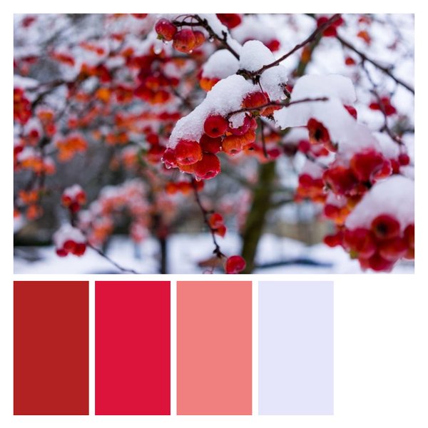
Frosty Berries
A stunning palette inspired by the ethereal beauty of snow-covered berries in winter. This color scheme combines the vibrant reds of ripe berries with the soft whites of fresh snow, creating a striking contrast that evokes both warmth and coolness. The palette's rich, deep reds paired with icy whites and soft greys capture the essence of a crisp winter morning. Perfect for holiday designs, winter-themed branding, or cozy interior spaces that aim to blend warmth with a touch of seasonal frost. This palette would excel in festive packaging designs, winter wedding themes, or creating a inviting atmosphere in Nordic-inspired interiors. It's ideal for businesses looking to convey a sense of tradition with a modern twist, particularly suitable for gourmet food brands, winter resorts, or luxury skincare lines targeting the holiday market.
White on Firebrick
Black on Firebrick
White on Crimson
Black on Crimson
White on Light coral
Black on Light coral
White on Lavender mist
Black on Lavender mist
White on White
Black on White


