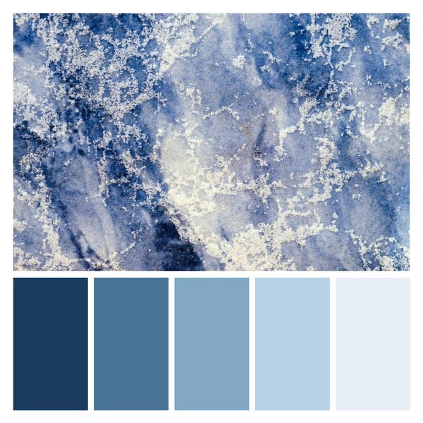
Frosty Crystalline
This enchanting palette captures the delicate beauty of ice crystals forming on a cold winter's day. The deep navy blue (#1B3C5D) represents the shadowy depths beneath the ice, while the lighter blues (#4A7496 and #82A8C4) evoke the translucent layers of frozen water. The pale blues (#B7D1E4 and #E6EFF5) shimmer like freshly fallen snow, creating a sense of crisp, clean serenity. This palette exudes a calm, refreshing ambiance perfect for winter-themed designs, spa branding, or modern bathroom interiors. It would complement cool skin tones beautifully and create a soothing atmosphere in bedrooms or meditation spaces. The frosty color scheme is ideal for businesses wanting to convey trust, clarity, and refreshing purity, such as bottled water companies, ice cream brands, or high-end skincare lines. Keywords: winter palette, ice blue colors, frosty color scheme, cool tones, serene color palette.
White on Poseidon
Black on Poseidon
White on Sea Drifter
Black on Sea Drifter
White on Stormfang
Black on Stormfang
White on Delicate Ice
Black on Delicate Ice
White on Clear Vision
Black on Clear Vision


