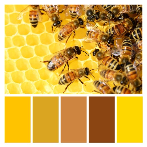
Honeycomb Harmony
This vibrant palette captures the essence of a thriving beehive, blending warm golden hues with rich amber tones. The colors evoke a sense of natural abundance, industriousness, and the sweet reward of honey. Psychologically, this palette instills feelings of warmth, energy, and productivity. It's ideal for brands focusing on natural products, organic foods, or sustainability initiatives. In interior design, these colors would bring a cozy, inviting atmosphere to kitchens or dining areas, complementing wood tones beautifully. The palette also suits businesses in the wellness or agriculture sectors, embodying growth and vitality. For web design, it offers a perfect balance of readability and visual appeal, especially for nature-themed or eco-friendly websites.
White on Citrus Splash
Black on Citrus Splash
White on Goldenrod
Black on Goldenrod
White on Peru
Black on Peru
White on Saddle brown
Black on Saddle brown
White on Web Gold
Black on Web Gold


